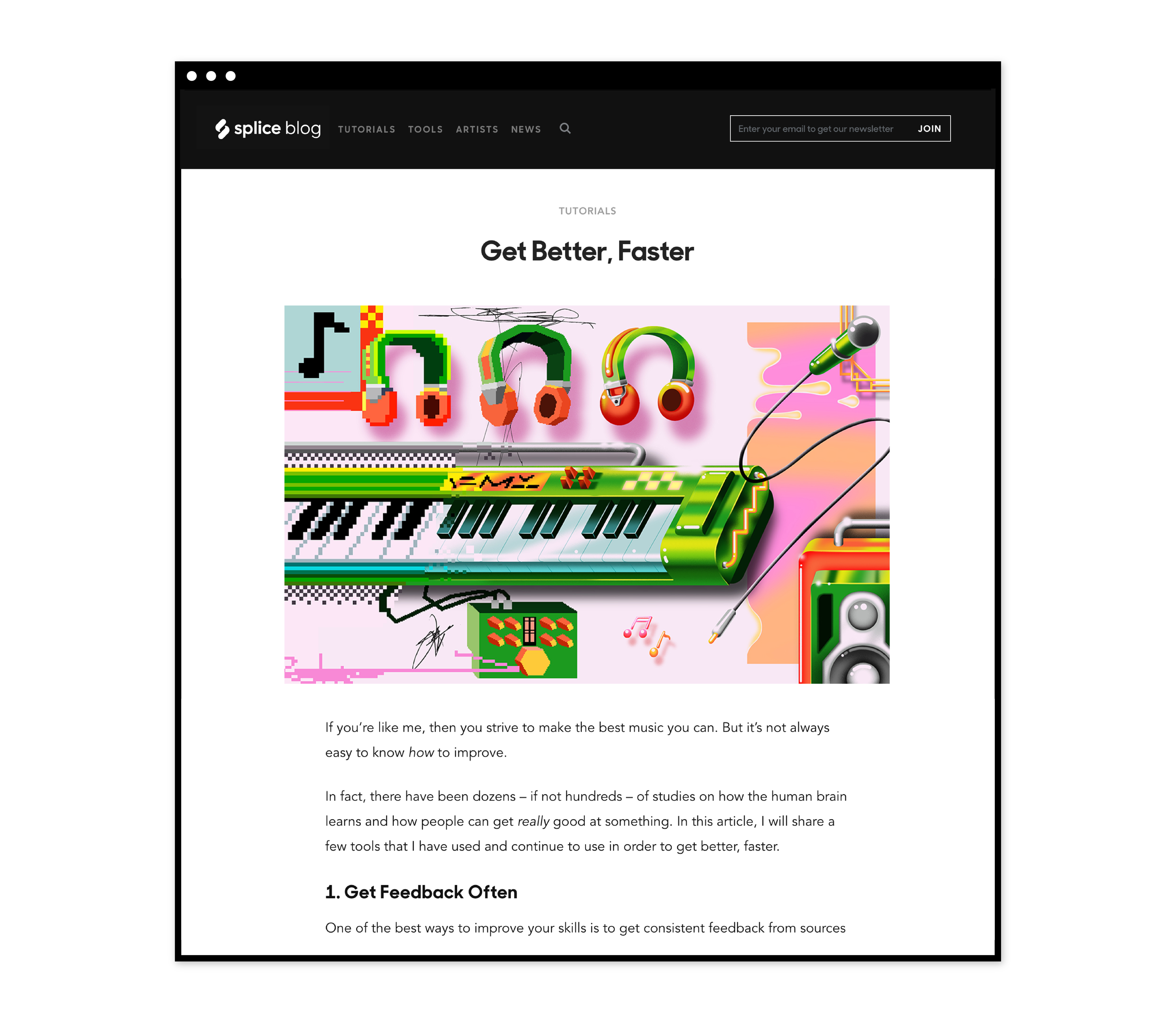
Launched in 2013, Splice quickly became a robust resource for musicians — a place to rent-to-own plugins, access samples, collaborate securely, and participate in a larger global community of sound. By simplifying the tedious process of working with music software, Splice empowers musicians and producers to hone their craft, develop their creative process, and release more amazing music.

After years of exponential growth, Splice soon found that its image and values were misaligned with the diversity of creativity that it enabled. As part of an initial core brand team, I was tasked with reshaping Splice's brand from end-to-end.

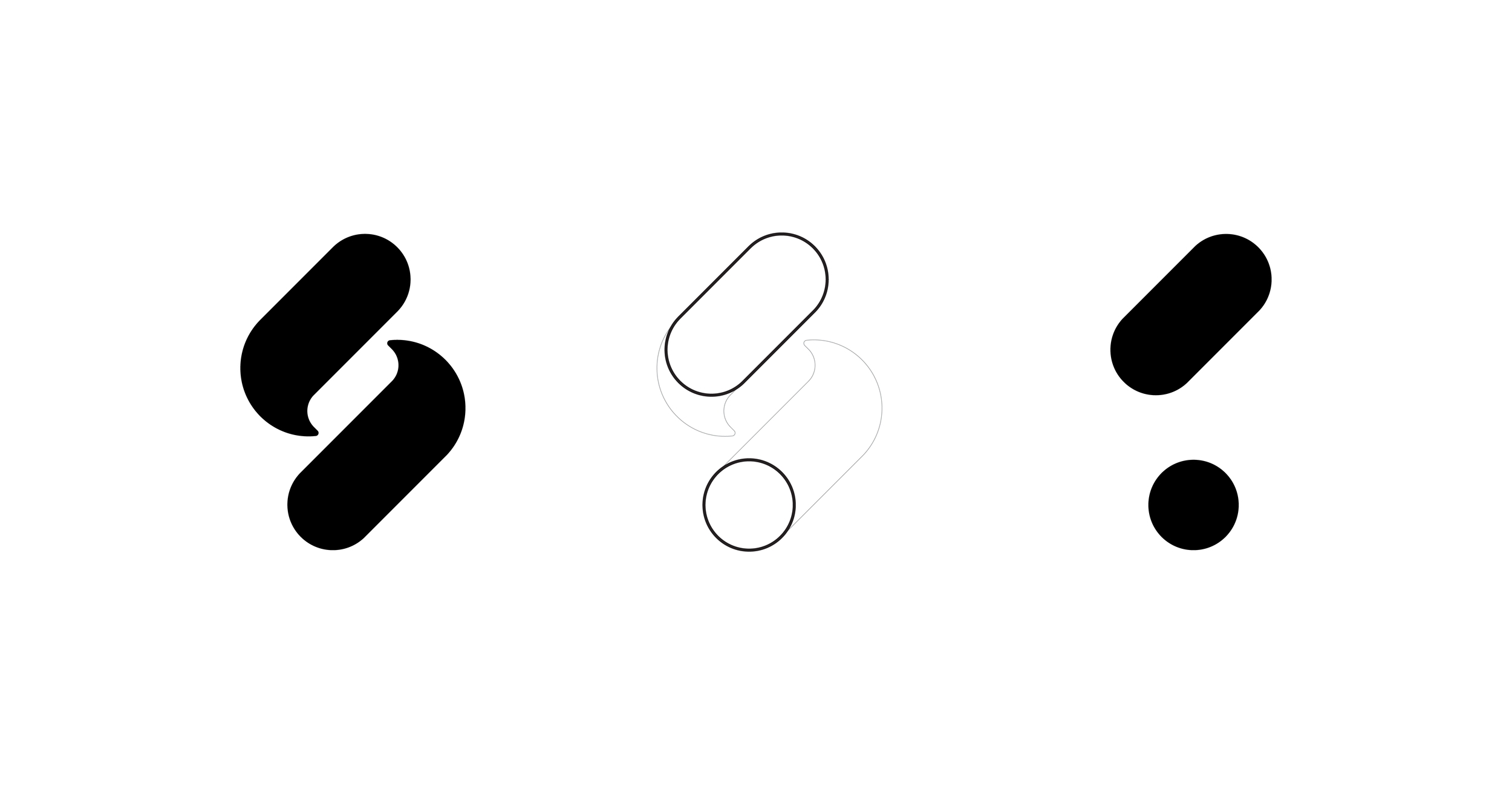
We worked closely with an external agency, R/GA London, on the initial mark and overall strategy. The remaining brand assets and rollout were then developed in-house, alongside additional collaborations with OMSE on a custom typeface and Heather Sten on photography.

As a design lead, I was responsible for shaping the primary visual language, photography & illustration direction, color palette, and overall system behind editorial content, campaigns, and social channels. I was also a crucial contributor to the entire visual direction of the mark, typeface, voice & tone, and brand strategy.

Additionally, I lead an overhaul of art direction for Splice’s education content, of which you can access a case study here.


LOGOMARK & INITIAL STRATEGY: R/GA LONDON

TYPE DESIGN: OMSE

PHOTOGRAPHY: HEATHER STEN

COPYWRITING: SIMON GOETZ

PRODUCT DIRECTor: AZZA ELSHEIKH

PRODUCT DESIGN: JAY SCHAUL & STEVEN NEAMONITAKIS

FRONT-END DEVELOPMENT: LARA WARMAN & JESS ELDREDGE

CREATIVE DIRECTor: CHRIS MUCCIOLI


Starting with the mark itself, it functions as both a reference to the letter "S" and also a symbol of creative flow — energy that is never confined, static, or linear.

Deck-01.png
Deck-02.png
 

The branding system accommodates variations for offshoot products and external partnerships.

 
Deck-11.png
 

The primary and secondary palettes were chosen for an emphasis on vibrancy, but without falling too deeply into candy-colored hues. Color is also a crucial feature of product & UX, and thus was considered / tested for usability as well as personality.

 
Artboard 1 copy 3.png
 

Much of this translated into a new editorial direction for Splice’s educational content, by expanding styles for different types of content both internally and with external illustrators.

Read the full case study here.

Blog_Web-01.png
 

Within Splice, the primary core of the visual language evolved from the mark itself — by isolating, separating, and remixing it's core shapes, I accessed an endless array of visual elements to complement or illustrate the brand, community, and artists themselves.

Deck-05.png
Deck-06.png
Deck-07.png
 

In instances and media that primarily focus on artists' stories, I pushed this concept further by using the shape system as a means to recontextualize artist photography itself.

 
Artboard 1 copy 7.png
 

Likewise, Splice also needed a brand typeface that performed just as well externally as in product. We partnered with OMSE in London to develop a custom cut of their Modern Era typeface that mimicked the strong, broad flow of the mark while also sustaining readability at small sizes. 

 
Artboard 1 copy 8.png
 

More than just the visual brand was rethought. Working with an in-house copywriter, Splice executed a complete overhaul of internal voice and tone, as a means to define company values and external copy in almost every user channel.

 
Deck-10.png
 

A new set of photography and photo guidelines was commissioned for both Splice's external marketing site and as a library for various future projects. Shot by Heather Sten, it consisted of five separate shoots with eight different musicians (all real users of Splice). Each shoot emphasized lighting as a contextual complement to each musician's specific creative process.

 
Artboard 1 copy 11.png
 

Finally, working alongside the product team, this was successfully implemented into both Splice's desktop app, web experience, and marketing website. This coincided with a redesign and restructuring of most of Splice's front-end code, allowing brand, copy, product, and engineering a new space for collaboration.

 
Deck-13.png
 

This case study is only a small portion of the incredible amount of work that went into reforming this brand, of which I'm happy to provide more on request.