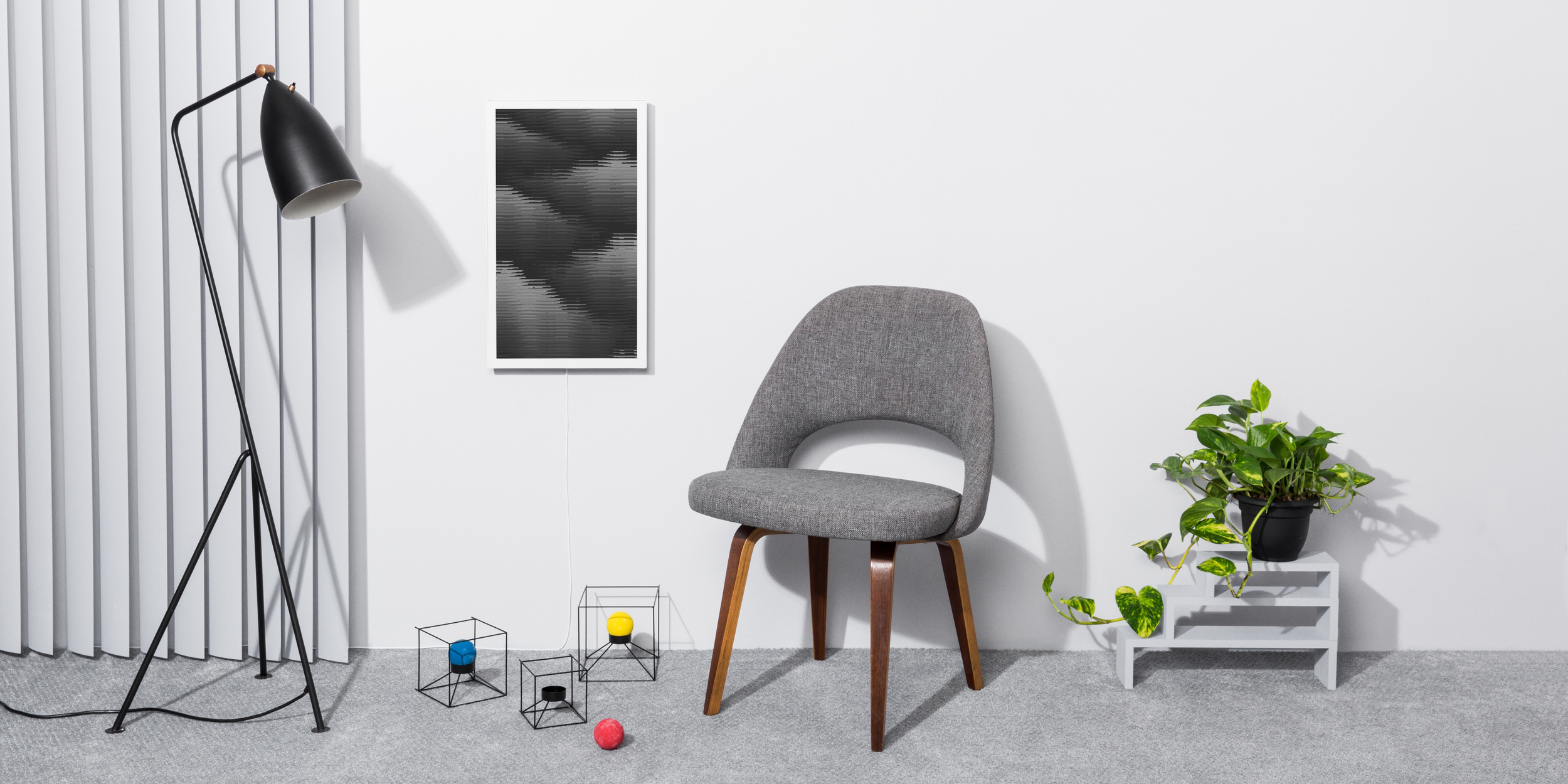
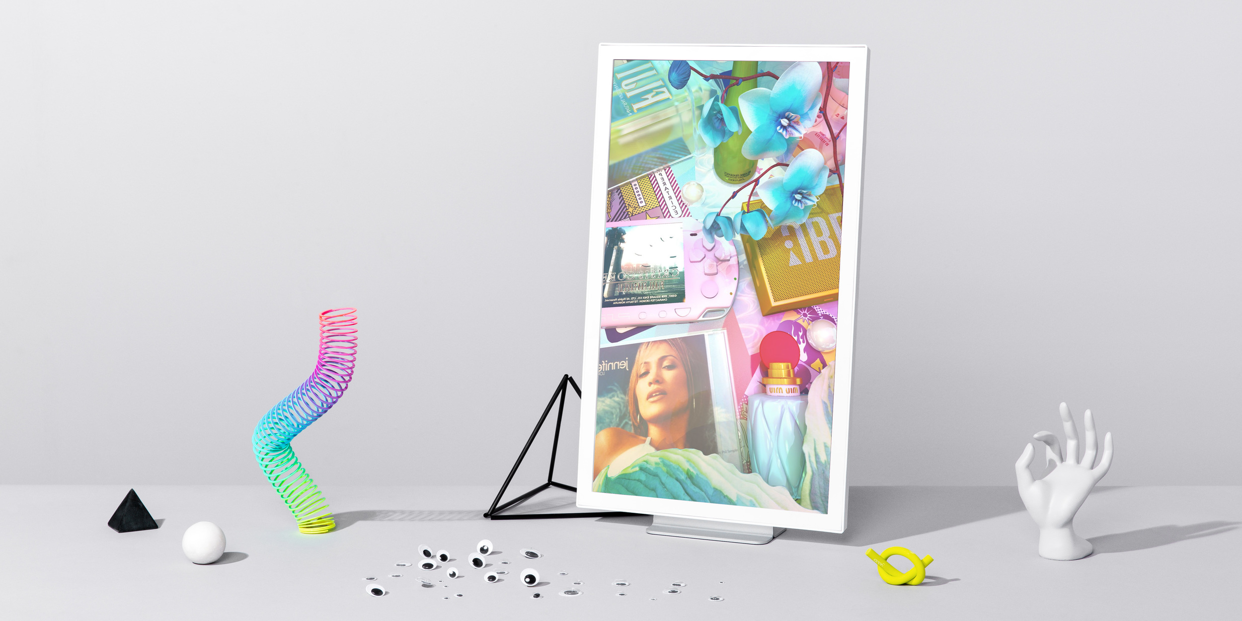
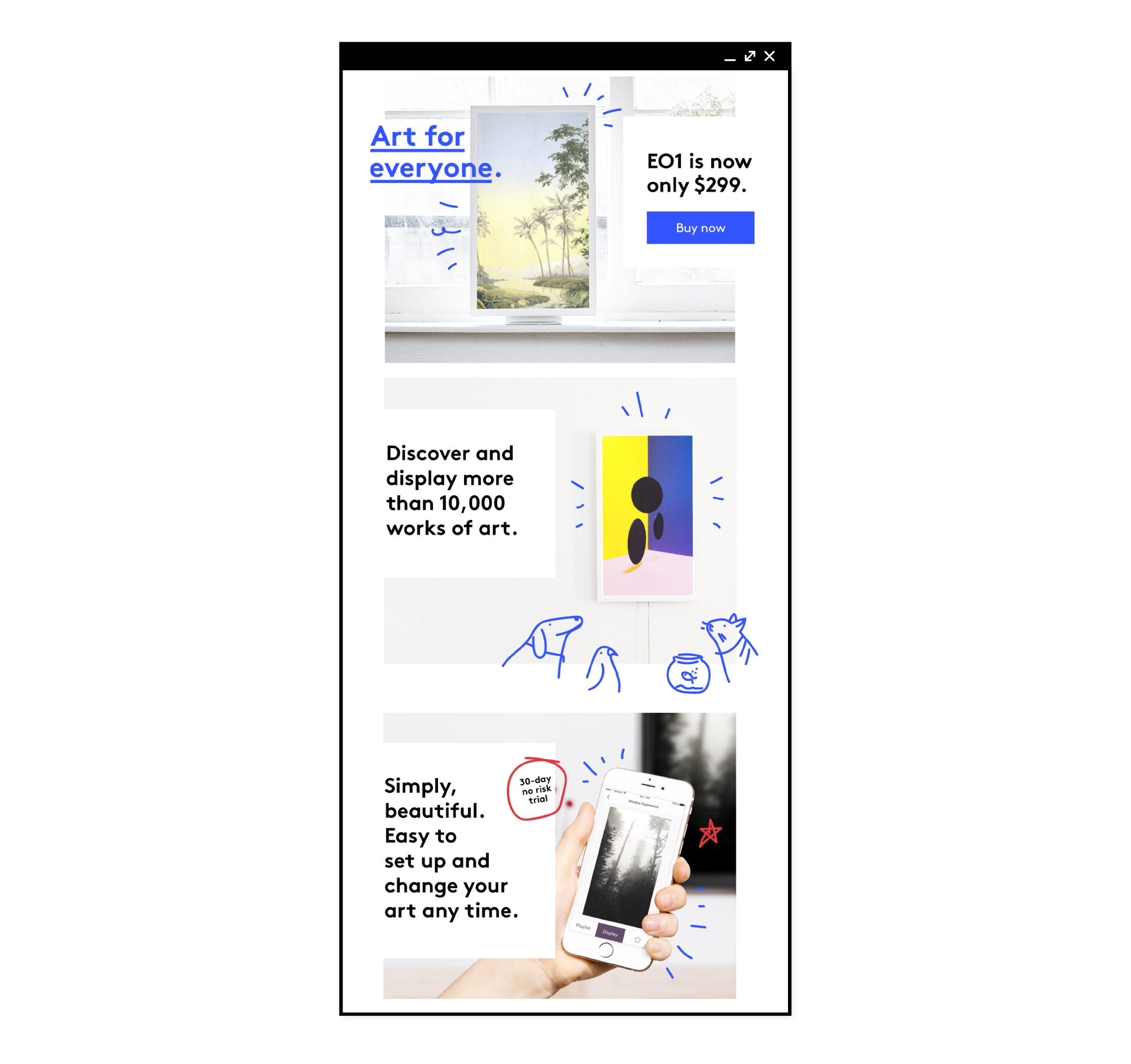
Electric Objects (acquired by GIPHY) created hardware displays for digital artists, alongside a mobile and web-based platform for discovering and collecting art.

Having grown from a wildly successful Kickstarter project to full-fledged product, EO needed a new voice, updated branding, and a beautiful experience to match.

As the first full-time design hire, I often led the process end-to-end in writing brand copy, producing visual design, directing shoots, and working nimbly with a lean team to highlight an incredible piece of consumer hardware and community.

Although my work below spans every area of the brand, I also worked extensively on product experiences. For that, there is a case study of product design here.

WEB DEVELOPMENT: CHRIS TAN

HARDWARE DESIGN: BILL COWLES

PRODUCT DIRECTor: LUKE CHAMBERLIN


Screen Shot 2020-05-18 at 8.13.37 AM.png
Screen Shot 2021-05-02 at 7.13.32 PM.png

Although there were tentative logo mockups and early explorations of brand voice, Electric Objects had outgrown much of it after it’s last Kickstarter campaign.

One of my earliest projects was auditing, concepting, and assembling a brand guide in both PDF and toolkit forms, which encompassed visual direction for both the hardware and web.


Working with photographer Stephanie Gonot, I commissioned and directed a series of expressive interpretations of the EO1 that went on to become the primary language for the brand’s web, social, and content channels.


Additionally, I allowed the brand to flex through various seasonal campaigns — ranging from Cyber Monday sales, to product feature announcements, to pricing drops and more.

Rather than settle for a standard marketing outreach, EO stayed true to a visual language that hearkened the early Internet — expressive, colorful, and full of curiosity.

 
unnamed-1-22.png
unnamed-1-23.png
 

Establishing illustration was also a cornerstone of the EO brand. I chose to play with a vibrant, vectorized style that could flex between product announcements to email campaigns.


Outside of campaigns, I also had an ongoing task of authoring an icon language for all hardware, web, and software platforms. In addition to illustrating standard user situations, the work was intended to address notions of displaying, collecting, and switching between artwork within a digital realm. 

 
unnamed-1-24.png

Even the logo itself was variable — often morphing into special iterations of the brand, such as this pin for the annual NADA art fair.

 
EO2_Pkg.gif
 

Lastly, the brand extended to the physical product hardware, packaging, and digital experience itself — check out a further case study on that here.